Fairygodboss
Case study for the redesign of Fairygodboss.com’s home page. Fairygodboss is an online career community and job board for women.
The Scope
-
I led the end-to-end design on this project, from conducting competitor research and ideation sessions, to early wireframing, visual design, prototyping, and user testing. With the help and close collaboration of the Director of UX, Product Manager and engineering team, I was able to see this design from the beginning through to its recent launch.
-
Design: December 2021 - February 2022
Development: March 2022 - May 2022
-
This page was the first to introduce a new visual direction for the Fairygodboss platform.
However, some aspects of the brand, such as colors, logo, and typographic styles were not up for redesign.
-
Figma
UserTesting
Hotjar
Google Optimize
Jira
The Problem
Fairygodboss’ previous home page wasn’t clearly communicating the company’s value prop, which was affecting the conversion rate of first time visitors into returning users. It was also in need of an aesthetic update.
Our hypothesis was that a clearly communicated value prop and updated look would attract more people who want to participate in the community, leading to higher conversion and engagement of new users.
Our goal was to increase conversions of first time visitors into members by 67%.

Our Users
Fairygodboss is a platform for early to mid career professional women in the US.
Internally, we have 4 distinct types of users that interact with our product: consumers, creators, contributors, and jobseekers. The home page was redesigned to specifically address these 4 users’ needs.
Initial Research
With the Director of UX, I conducted user testing on the current home page, to get a sense of what was blocking first time visitors from registering. We were surprised to find that:
Most women immediately classified the site as a job board rather than a holistic career community.
The highest perceived value on the old page was in data that we don’t actually offer, mainly salary information.

Low-fidelity
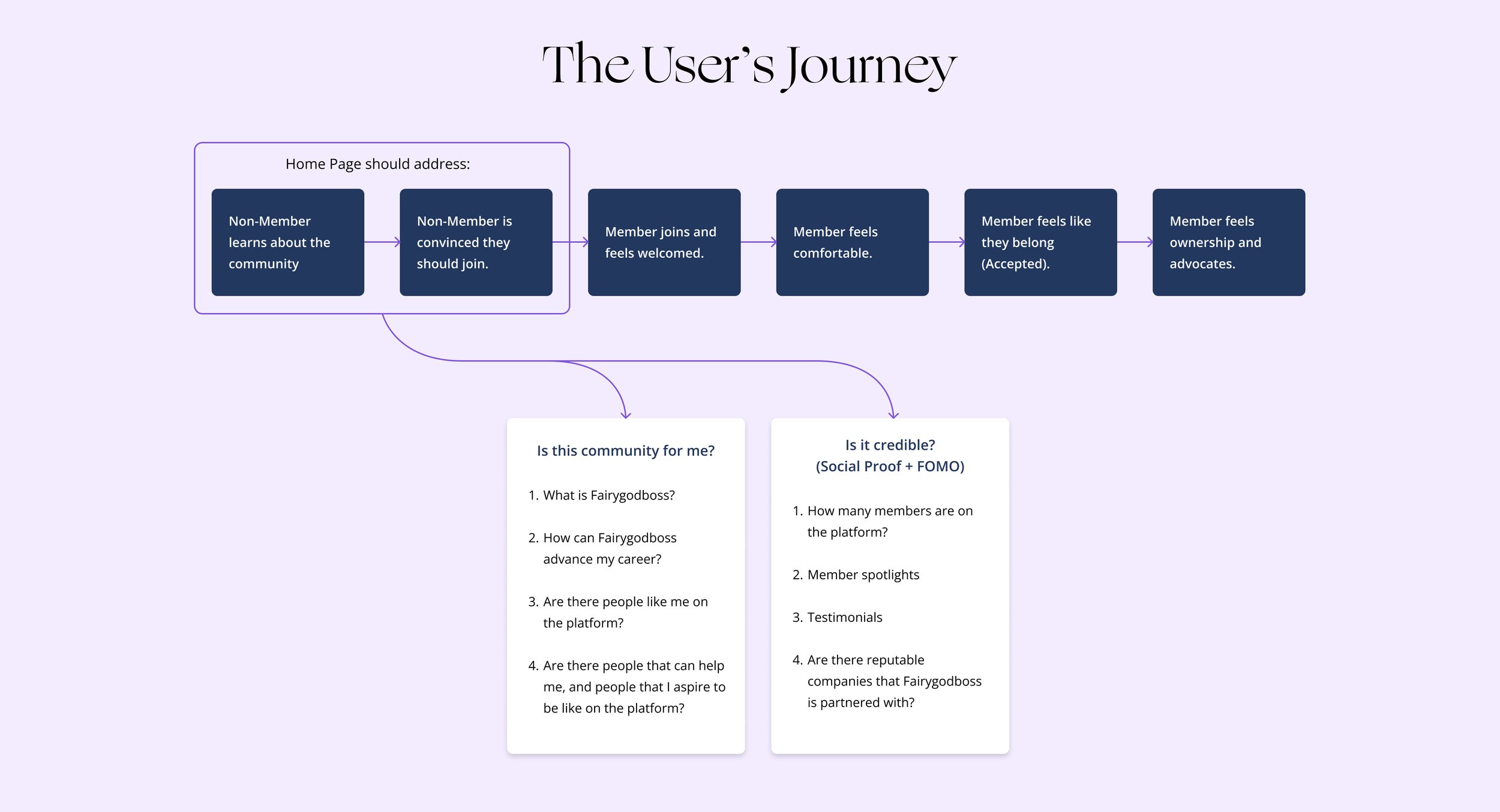
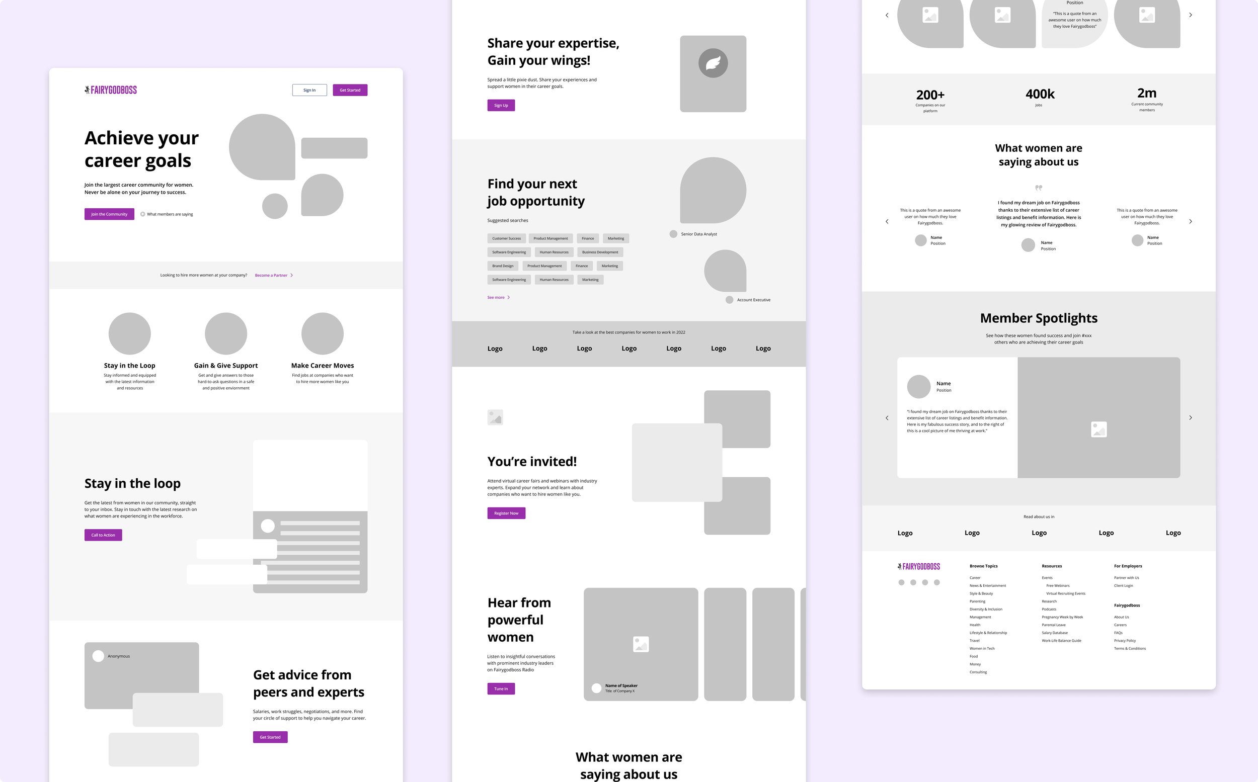
With these insights in hand, I mocked up low-fidelity wireframes of a homepage that clarifies our value prop and addresses how each of our 4 user types can benefit from becoming a member.
Leveraging the
Design System
One challenge in being tasked with designing a new visual direction for the site was how to update and modernize the look and feel of our home page, without straying too far from what users will experience on the rest of the platform.
Using styles and components from the Design System that our design team was working to build out helped shape a foundation for consistency.


UI Challenge
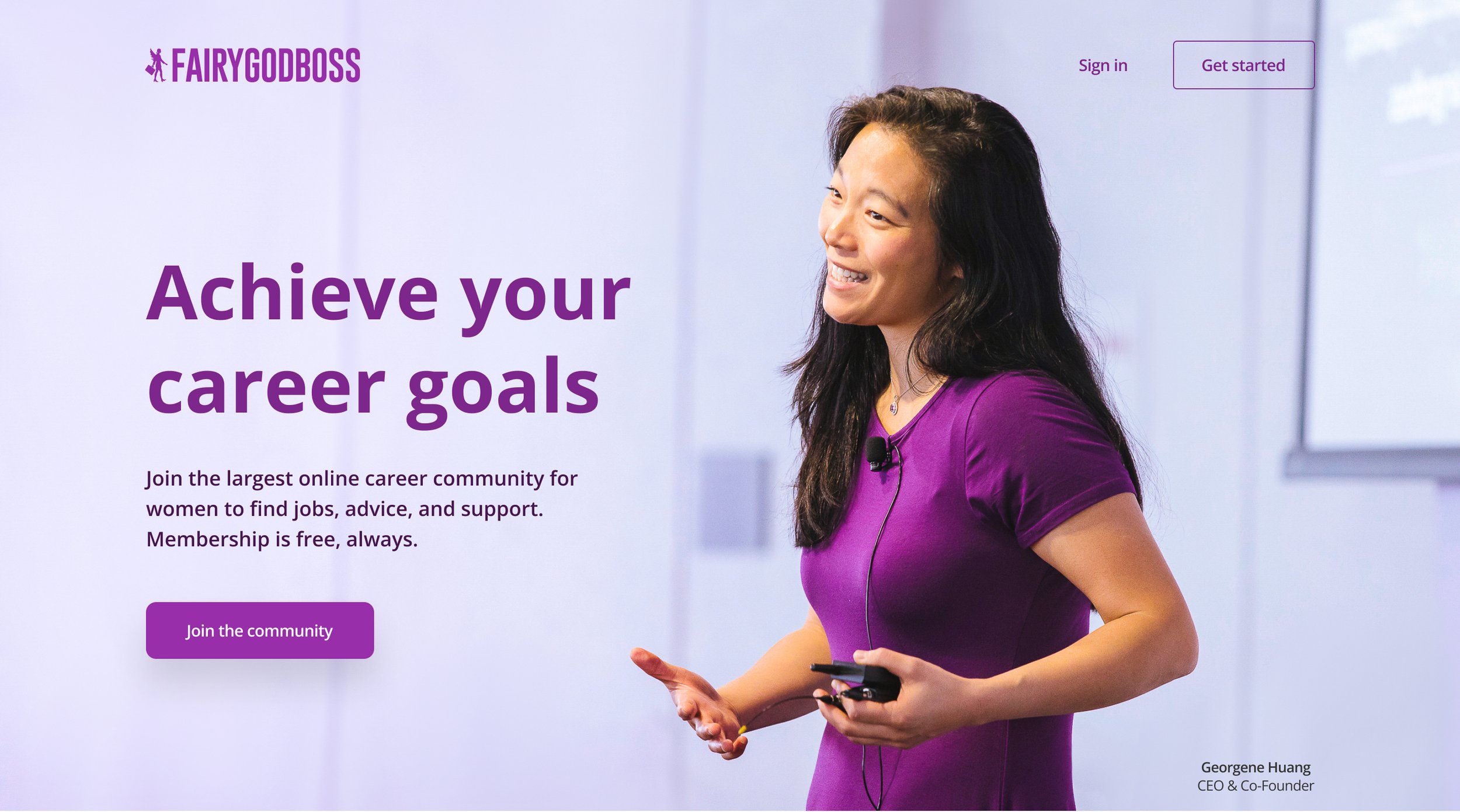
Another hurdle I faced was in how to use imagery on the site. It was important to back up our messaging by showing photos of real and diverse women, but we didn’t have much recent or web-ready photography, and wanted to avoid using generic stock photos.
We tested 3 variations of the home page, switching out the imagery above the fold to see which resonated better with users, which established more trust, and which better communicated our offering. The photo of our CEO was the clear winner.


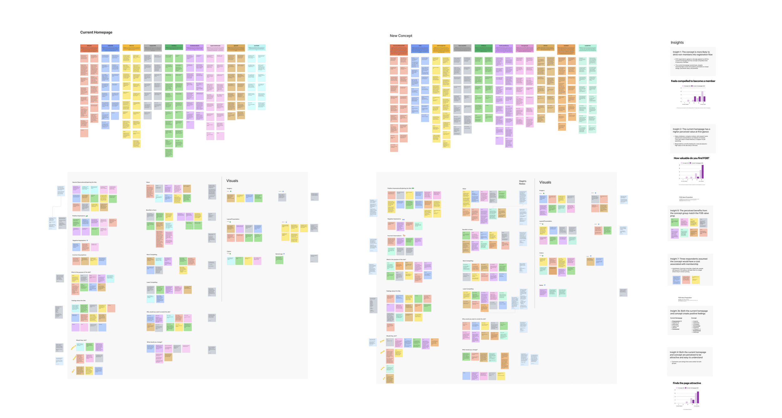
Testing Insights
With a high-fidelity prototype, we conducted more user testing of the new concept side by side with the old site, and were able to get user validation that we had taken the right direction in the redesign. We were communicating value, compelling a higher rate of users to sign up, and eliciting a stronger positive emotional response to the new page.
Issues to Solve
We also uncovered a few issues, such as users thinking they’d have to pay for membership, and questioning whether we’re an online or in-person community.
To solve for these hiccups, we collaborated with our community (content) team to comb over the page’s copy and further clarify our intent while adhering to our brand’s language guidelines.
“It achieves being light and playful, but also serious and sophisticated at the same time.”
— User during testing
Make it responsive!
Once we had stakeholder approval and a user validated concept, I pushed Figma to its limits to create a fully responsive experience.
This ended up aiding our developers a lot in understanding how the site should resize.
Development
After organizing, annotating, and handing off my designs to engineering, I worked closely with our front-end developers and QA team to answer questions, conduct product review, and help bring the page live.
After living on a variant URL for 2 months during A/B testing, the page officially launched 2 weeks ago!
See it live at Fairygodboss.com
Was it a success?
2 weeks post launch, we have not quite met our goal. We have seen a 49.6% increase in conversions, and after watching Hotjar recordings on user behavior, have lined up more A/B tests to optimize the page further.
We also surprisingly saw a statistically significant increase in apply clicks to job postings, which is an entirely separate product goal.
The page has also set the new precedent for the visual direction of the site moving forward, and several other projects are already in development that match the new home page’s look & feel.
Retrospective
What went well?
Collaboration amongst those involved was very smooth — we were all aligned on the goal and I was given a lot of autonomy and room for creativity in exploring a brand new visual direction.
I also uncovered some great tricks and capabilities in Figma that helped me communicate the interactivity in the design a lot more clearly to engineering.
What could be better?
How great it would have been to hit that goal on the first launch! But with any living design, there is always more to A/B test, optimize, and figure out the very best configuration of sections.
I would have loved the opportunity to spend more time building in micro-animations, and making more of the information dynamic and interactive (pulling in the latest article, for example).
What didn’t go well?
Although it didn’t turn out to be too terrible a crisis, this was the first project I did not design mobile-first, and it proved a lot more difficult to size down than it is to size up.
A lot of time was wasted combing through stock photos and trying to manipulate old photography into working as a hero image.
Credit
Director of UX
Will Hortman
Product Manager
Kelleri Riegel
VP Product
Akshay Singhal
Product Designer
Stephanie Shaw
Front-End Developer
Michael Senejoa
Software Engineers
Jesus Poveda
Bradford Farmer
QA Engineers
Andra Pasenciuc
Elakshi M